OJS - Theme Features: Difference between revisions
mNo edit summary |
mNo edit summary |
||
| Line 82: | Line 82: | ||
# '''The Clasical Style''', Visit '''[https://demo-ojs.ashvisual.com/index.php/ja theme demo website]''' | # '''The Clasical Style''', Visit '''[https://demo-ojs.ashvisual.com/index.php/ja theme demo website]''' | ||
</div> | |||
</div> | </div> | ||
</div> | </div> | ||
| Line 104: | Line 105: | ||
<hr> | <hr> | ||
'''Option Field Type:''' Checkbox | '''Option Field Type:''' Checkbox | ||
[[File:ArticleGenesisOptions.png|none|thumb|Click image to enlarge]] | [[File:ArticleGenesisOptions.png|none|thumb|500x500px|Click image to enlarge]] | ||
| | ||
<hr> | <hr> | ||
| Line 119: | Line 120: | ||
<div class="card-body"> | <div class="card-body"> | ||
'''Description''' | '''Description''' | ||
<p> | <p>The article detail and article summary pages will feature information on the number of galley downloads and abstract views, offering valuable insights into the article's engagement. This data will be displayed prominently, allowing users to track the level of interest in the article.</p> | ||
<hr> | |||
'''Option Field Type:''' Radio Select | |||
<div class="row"> | |||
<div class="col-md-4"> | |||
[[File:StatisticsOptions.png|none|thumb|Click image to enlarge]] | |||
</div> | |||
<div class="col-md-8"> | |||
<p>There are three settings available for how this information is presented:</p> | |||
# '''None''': No data regarding galley downloads or abstract views will be shown on the page. | |||
# '''Basic''': Only a simple count of galley downloads and abstract views will be displayed. | |||
# '''Dimensions''': A more detailed breakdown of the galley downloads and abstract views will be shown | |||
</div> | |||
</div> | |||
<hr> | <hr> | ||
'''Preview''' | '''Preview''' | ||
Revision as of 09:52, 19 March 2025
The latest version of the Ashvisual theme for Open Journal Systems (OJS) introduces seven innovative features designed to enhance and beautify the visual appearance of your OJS website. These features provide users with customizable options to improve both aesthetics and functionality, ensuring a modern, polished, and user-friendly design. The following is an explanation of these features.
Description
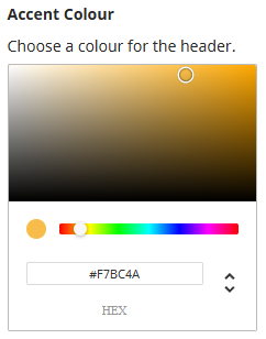
Choose a color for both your primary and secondary color themes to personalize your design, ensuring it aligns with your desired aesthetic. Alternatively, if you have a specific color in mind, you can manually enter the exact hex codes for each color. This allows you to fully customize the color scheme to your exact preferences, giving you more control over the look and feel of your design.
Option Field Type: Click and choose / Hex code
Description
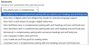
Choose the appropriate font combination that best suits your design and aesthetic preferences. We have carefully curated and provided 9 thoughtfully selected combinations for you to choose from. Each combination is designed to offer a balance of style, readability, and visual appeal, making it easier for you to create a cohesive and professional look for your project. Feel free to explore the options and select the one that best aligns with your vision and the overall tone you want to convey.
Option Field Type: Dropdown Options
- Plus Jakarta Sans/Noto Serif: The heading uses a plus jakarta sans font, and text uses a serif font
- Noto Sans: The entire website uses the sans-serif font
- Noto Serif: The entire website uses the serif font
- Noto Serif/Noto Sans: The heading uses a serif font, and text uses a sans-serif font
- Noto Sans/Noto Serif: The heading uses a sans-serif font, and text uses a serif font
- Montserrat/Noto Serif: The heading uses a montserrat font, and text uses a serif font
- Lato: The entire website uses the Lato font
- Lora: The entire website uses the Lora font
- Lora/Open Sans: The heading uses a Lora font, and text uses Open-sans font
Description
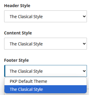
These sections form the core structure of a website, and their design can significantly influence the user experience and overall visual appeal. The available styles are categorized into four main types: PKP Default, Classic, Creative, and Modern, each offering a unique aesthetic and user experience. Additionally, you have the flexibility to combine these styles to create a hybrid design that best suits your website’s needs. For example, you might choose a Classic header, a Modern content layout, and a Creative footer to achieve a distinctive and dynamic look. This approach provides greater customization, allowing you to cater to your audience while maintaining a cohesive and engaging design.
Option Field Type: Dropdown Options
We are committed to enhancing the user experience by introducing new visual aesthetics and layouts to suit different design preferences. To keep you informed, you can easily track the progress of these updates by referring to our development roadmap, which includes a detailed release schedule outlining when new styles will be available. This will help you stay up to date with the latest improvements and anticipate the next steps in the evolution of the theme.
In the current version of the theme the following styles are available:
- PKP Default Theme, Default theme view of Open Journal Systems platform
- The Clasical Style, Visit theme demo website
This content is currently under construction, it will be available in the next few weeks. contact us if you have any further questions.
Description
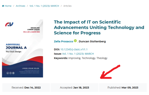
The article details page will display the complete timeline of the article's journey, including the date it was received, the date it was accepted, and the date it was published. This provides users with a clear understanding of the key milestones in the article's progression, from submission to final publication, ensuring transparency and offering insight into the article's lifecycle.
Option Field Type: Checkbox

Preview

Description
The article detail and article summary pages will feature information on the number of galley downloads and abstract views, offering valuable insights into the article's engagement. This data will be displayed prominently, allowing users to track the level of interest in the article.
Option Field Type: Radio Select
There are three settings available for how this information is presented:
- None: No data regarding galley downloads or abstract views will be shown on the page.
- Basic: Only a simple count of galley downloads and abstract views will be displayed.
- Dimensions: A more detailed breakdown of the galley downloads and abstract views will be shown
Preview
- None: Disable any statistics

Click image to enlarge - Basic statistics: Displays the number of downloads and views

Click image to enlarge - Dimensions Statistics AI: Display dimensions citations and statistics

Click image to enlarge
This content is currently under construction, it will be available in the next few weeks. contact us if you have any further questions.


